By
Chris Bernstein
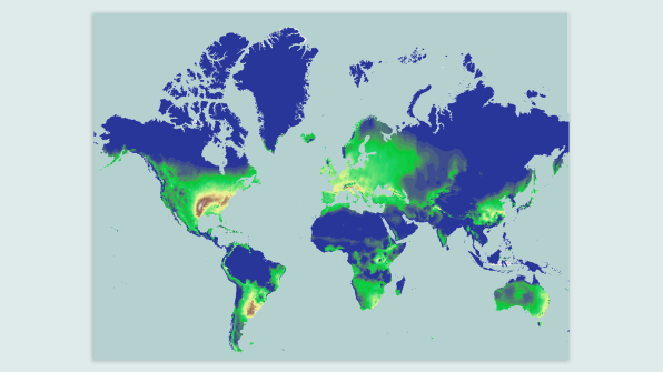
According to an article on fastcompany.com, a
professor at the University of Cincinnati has created a map that shows where
types of weather will change around the United States due to climate change.
The map gathers climate change data from WorldClim public database and looks
for climate similarities generated from historical data as well as projections
until the year 2070. One of the key highlights of the map is its ability to
visually represent climate change around the world.
“For the U.S., the biggest
changes are on the West Coast, parts of the East Coast, and in the Mississippi
Delta region. Much of the central U.S. is shaded in green, indicating less
extreme changes in temperatures and precipitation patterns by 2070,” the article states. In
addition to the map offering data based on individual cities in the United
States, it can also link matching climates from places across the world. “For
example, California’s Napa Valley has climate twins on the west coast of South
America and in northwestern Africa.” The map offers many benefits to the public
who may be planning on where they will end up living in the future, but it also
benefits researchers who need visual aids to communicate these issues to more
people.
I think this map is a great tool to use when trying to
communicate to people how important the threat of climate change is. In my
opinion, this map is not the most effective tool for raising people’s concerns
about the potential effects of climate change. However, I do think it’s a great
start in trying to do so. Raising awareness of an issue or problem takes form
in many different ways and this map is just one of them. I would suggest taking
this map and altering it to be more appealing to a wider audience and making a
more enjoyable, interactive experience. That being said, it is still a great
tool and brings attention to an important issue that not enough people take the
time to learn about.
Another issue that arises with this map is that it does
not represent absolute accuracy. To someone like me, I see this as a pure
estimation—even though it is backed up with data. I’m sure the data is correct,
but no one can predict the future, so if anything, I think this map is designed
for starting conversations and hopefully igniting passion amongst people who
are ready to help the environment.
Learn
more and read the article:
No comments:
Post a Comment